For many years now, sports leagues have attempted to sell more merchandise to fans by creating all sorts of alternate logos and designs. Sometimes these arrangements are well done, and often times, they are not.
For Major League Baseball’s 2020 spring training games, all 30 teams got new hat designs. As the headline of this post might tell you, they are mostly not good at all.
Let’s first dispense with a couple logos that did turn out pretty well. The Detroit Tigers have the only outright winner, using subtle tiger stripes to accent their “D” logo in wonderful fashion:

The Toronto Blue Jays have something a bit different, but it’s solid overall:

There are a couple other decent results, but it’s far more fun to look at the crap. Many of the caps look like they were misprinted, from the New York Yankees:

…to the Milwaukee Brewers…:

…and most especially, the San Diego Padres:

At the very least, it would be difficult to state definitively that there’s not a swastika in there.

Possible neo-Nazi designs aside, the single most ridiculous logo belongs to the Baltimore Orioles, which sort of looks like a bird with either a giant head or a tiny body:

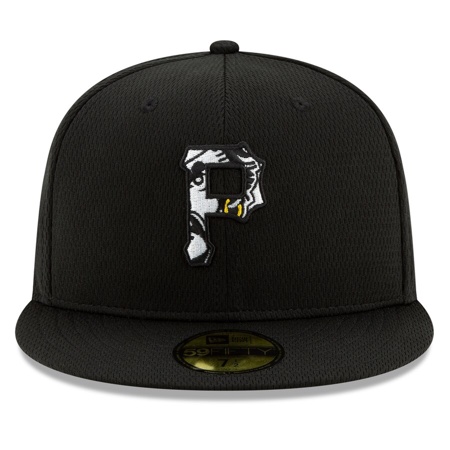
My favorite, however, are the creepy logos. The buccaneer mascot of the Pittsburgh Pirates is staring at you through a picket fence:
While the Arizona Diamondbacks appear to be attempting to get you kicked out of the garden of Eden:

But it’s Mr. Redlegs, of the Cincinnati Reds, who really takes the cake. He is really creeping on you something fierce:

I know it goes against all logic and reason, but it really seems like shoving one logo inside of another logo is not a great way to design a third logo.
Update (February 13th, 2020): The Padres, at least, are opting not to use their hats.